Visual tests using Chromatic
October 27th, 2021 — 14 min read
Component libraries and design systems have become very popular nowadays. There are plenty of awesome component libraries available out there such as Ant Design, Chakra UI, Material Design, and others. Companies are also creating their own component libraries and design systems in order to have all their design standards encapsulated in one place. Some I can mention are Polaris (Shopify), Garden (Zendesk), and Sous Chef (7shifts). This last one is awesome, I helped to shape it when working at 7hifts 😉.
Maintaining a component library requires a high level of confidence from the test suite as there are a lot of different clients using the components, and each client expects the library to work properly. Introducing UI changes by mistake will decrease the users' trust in the library. Therefore, good tests become even more important to prevent releasing bugs.
Right now, most of the testing libraries (React testing library, Jest, Cypress) ensure the behavior is as expected, for example, they assert if clicking in a given button some action will be executed.
Imagine a hypothetical situation where someone changes the primary color by mistake, let's say red. All the tests passed as no functionality was changing. No one notices this change on the PR, it gets merged to master and a new patch release is pushed. You know what happens next. You are right, everyone starts asking why the entire app changed color when the library was updated!
In order to catch this earlier, we need to set up visual tests, also known as regression tests. Let's take a look at what it is.
Visual tests
If we had to do a manual visual test we would probably open in the browser the app running in prod and the app running on the branch with the changes, and we would manually compare the components to ensure they look the same. This might work at first but, this does not allow for scalability. We need a solution that does that comparison automatically for us.
An ideal visual test suite would take and keep the components' snapshots from the master build (production), and it should compare with the snapshots taken based on the new branch build (PR). If two images look different it would notify in the PR. Percy, Reg Viz and Chromatic are some tools that offer this possibility but, for this blog post, we are going to focus on Chromatic as it plays really nice with Storybook (an amazing framework for documenting components).
What is Chromatic?
Chromatic automates gathering UI feedback, visual testing, and documentation, so developers can iterate faster with less manual work. It is made by Storybook maintainers, which means it keeps up with the Storybook upgrades.
The nice thing about Chromatic is that it brings designers closer to the development cycle, creating an approval process for the UI changes and integrating it with Git, which means if the designer approves the UI changes it makes the PR CI pipeline green, otherwise it would fail the pipeline.
This is cool, as now designers don't need to do technical stuff such as pulling the branch locally to run the app to check the changes. Despite catching wrong visual changes, it also is great for when new components are created as well as for introducing new design updates as designers can take a look and play with the component from a centralized dashboard.
How it saved the day
I am going to share a real situation that happened to me when adding a simple fix for a bug. It was on a component called FormRow, which is responsible for placing form inputs side-by-side. If one of the inputs doesn't have an empty label it would not align properly, as shown in the image below.

The PR with the solution was very simple, basically, it just adds the following CSS rule min-height: 22px. For me, it looked very good, it solved the bug!

As I was only focused on the bug fix, I didn't notice I have added a larger value for the CSS rule which made all the labels increase a little the space they take. Hopefully, we had visual tests in place helping us to catch it earlier. In the image below you can see Chromatic found 55 changes where it should be only 1.

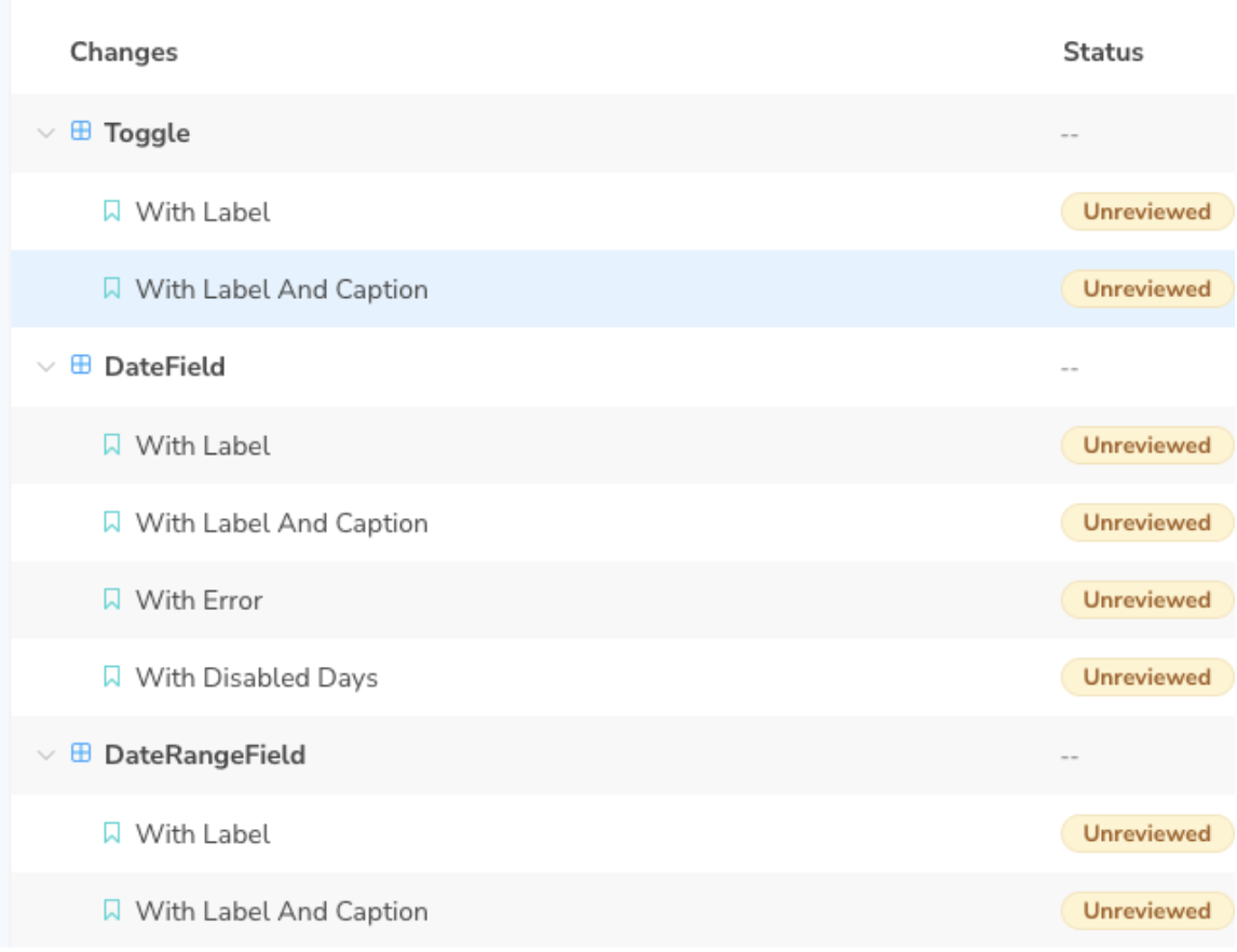
When clicking in Details it shows a dashboard with all the stories with UI changes. Oops! That was clearly something I didn't intend to do.

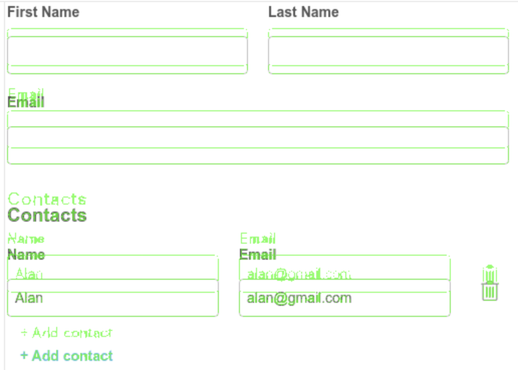
When clicking and navigating to the UI changes it shows a neat view for the snapshot comparison. You can press a button to toggle the before and after images to make it easier to spot where is the difference. It also provides the possibility to place one image above the other with color inversion to make it even easier to see the difference. The image below shows how all the form was pushed down with the changes I made.

You see, in the beginning, the change is very shuttle, but as the form grows the difference becomes more evident. Thanks Chromatic for catching it, you saved the day!
After updating the code and pushing a new commit, the visual tests were executed again, and now it looks much better, only the change I wanted is in place 👌.
Let's wrap it up
Given the responsibility maintaining a component library takes, it requires a high level of confidence from the testing suite, and adding visual tests increases the confidence a lot as it uses snapshot comparison to catch wrong visual changes before your clients do.
Besides the benefits of having visual tests in place, Chromatic also provides an integrated process for bringing designers closer to the development cycle which boosts productivity as designers can focus only on what they do best, designing.
Subscribe to my newsletter
Subscribe to get my latest content by email.
